


Downtown Arlington’s new logo that was introduced yesterday has me perplexed.
I’m here at my computer, snarky as ever, smelling blood, ready to pounce.

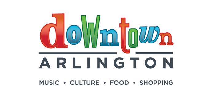
But I can’t find much to poke with a stick, even though the logo has infuriated many Arlingtonites who view its design as overly simple and childlike.
Yes, I see the varying fonts and colors used in “downtown.” I like them.
And I like how the letters in “Arlington” are the exact opposite — all rigid and uniform.
I like how the underline is interrupted below the “t.”
I like how the colorful letters make me yearn for a Popsicle.
I like how “music” is listed before culture, food, and shopping.
I suppose I could joke about how a lonely tumbleweed might be a more apropos logo for Arlington’s historically comatose downtown area.

Downtown, however, is relatively vibrant these days.
It’s no epic pleasure palace, of course, but museums, galleries, a pavilion, stage theater, music theater, farmer’s market, new streets, sidewalks, and lights have all combined to elevate downtown from the “sleepy laughingstock” category to “earnestly trying.”
Alas, my snark tank remains full — but ready to runneth over at a more appropriate time. Pray that you are not the topic of my next Blotch post.


It’s so…. colorful! Like a rainbow!
Diversity of typefaces indicates inclusion, where serifs and sans-serifs alike can mingle and blend in a….
Wait.. $30K??
Can we just get something from Fastsigns?
Graphic designers got babies that need shoes too — including the baby that obviously designed that childlike logo. Zing! The snark is back. Thank you Obama’s Seat for reawakening my soul’s inner smart-ass!
That baby has a great future as a dishwasher.