


")

Artisan ales are not worth an acre of hops if the artwork doesn’t tell a good story. Craft beer logos and labels do the most heavy lifting when it comes to visual appeal, featuring quirky and unorthodox characters dropped into the middle of familiar scenes.
A poor design crushes more than cans, whereas a powerful design can rally a large following of enthusiasts.
Pouring Glory

“There were doodles and doodles and pages and pages of ideas,” said Kevin von Ehrenfried, co-owner of Pouring Glory, a growler filling station with gastropub-style fare on the Near Southside. “The name we chose just popped off the page, and our art definitely sends a message.”
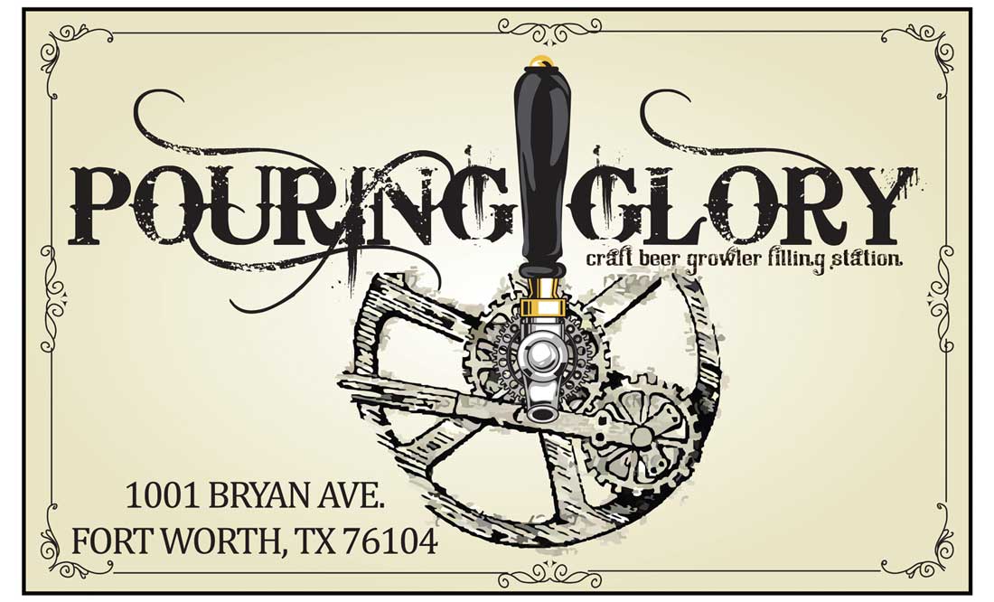 In the company logo, a heavy metal gear encircles “PG,” the two initials carefully constructed by miscellaneous gadgets and tools. Printed in several different colors and updated with slight alterations, almost all editions of the logo feature the full name of the establishment spelled out in antiqued serif font. Plenty of regulars and passersby comment on the large version of the logo gracing the outside of the building, a dark metal sign cut by lasers and decked out with copper grommets which underscore the business’ anachronistic style.
Inside, the industrial look of the logo is highlighted by wall art featuring various gears and machine parts that no longer move but do give a sense of movement to the old brick walls of the building, built circa 1943. Von Ehrenfried and his business partner, Scott Glover, set about town looking to expand the message of their steampunk logo with interesting interiors. In Fort Worth’s junkyards, the co-owners salvaged antiques, turn-of-the-century ceiling beams, and even a few bricks torn up in the construction around South Main Street.
Von Ehrenfried, who said he’s always appreciated the tenor of industrialization, said, “It is all art: the inside [of the bar], the sign, the logo … and [we] incorporate everything together to have a big impact.”
The Collective Brewing Project
Often on tap at Pouring Glory is Petite Golden Sour, a beer brewed down the road at The Collective Brewing Project. The sour ale’s label sports a yellow canary with a Mohawk and a spiked bulldog collar, just one of many punk rock-inspired labels created for the brewery’s current line of beers.
![]() Local freelance artist Josh Boyd dreamed up the brewery’s main logo. Collective Brewing co-founder and head brewer Ryan Deyo credits Boyd for bringing into balance several different elements that the founders deemed essential to the brewery’s establishment.
Local freelance artist Josh Boyd dreamed up the brewery’s main logo. Collective Brewing co-founder and head brewer Ryan Deyo credits Boyd for bringing into balance several different elements that the founders deemed essential to the brewery’s establishment.
“It’s a steelworker type of guy, and then there is a hop leaf on one side and the element of fire on the other [side], which is important to the brewing process,” Deyo said.
The logo is a rounded badge framed by the name of the brewery. A blazing red background offsets the yin-yang contrast of hop on flame, white on black.
The earliest versions of Collective Brewing’s logo spotlighted a similar silhouette but without the sharp edginess of the steel-working industry.
 “Our original logo had the field worker and was inspired by the Belgian farmhouse brewing tradition,” Deyo said. “We took our name from the saison tradition of brewing beer for the field workers and their families, who formed collectives and would throw parties about coming together and brewing beer for the people who work on farms. We’re about coming together around brewing beer.”
Deyo added that his own collective of friends and family banded together to launch the brewery in 2014.
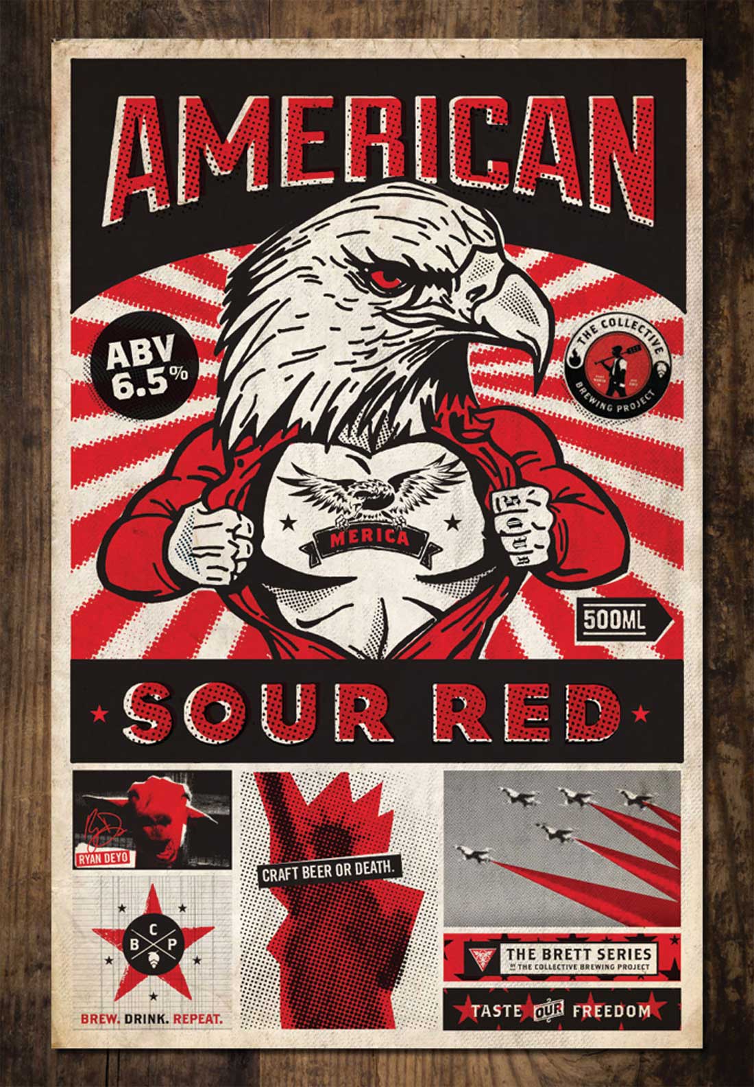
Several remarkably rad labels have rotated through the Collective Brewing taproom, but soon a new line of beers will launch with new labels created by Caliber Creative, a branding company that has designed art for Deep Ellum Brewing Co. and Craft and Growler in Dallas. Deyo describes the new label art as having a “completely different look,” one grounded in lucid dreaming and woodcutting.
“We came up with a very loose idea for these new beers from one of our oak tanks, and we let Caliber get weird for us,” he said.
Martin House Brewing Co.
In another origin story, community takes center stage in the art designed for Martin House. The brewery’s well-recognized mascot, a martin (a type of bird), flies into the company name. Head brewer and co-founder Cody Martin designed the logo.
“There are a lot of cool things about martins,” said Martin, pointing to a split-level, multi-family birdhouse for martins in his brewery yard. “They are the only bird that will live with other bird families. So if a sparrow took a nest [in our birdhouse], the martin would kick out other sparrow families.”
![]() Any other reasons for the mascot?
Any other reasons for the mascot?
“And my last name is Martin, so it all works out,” he said.
Martin pointed out that both his beer and his logo art began as humble creations, evoking feelings he would describe as things being better when they are made by hand. As his company has grown, Martin has passed the work of logo artistry on to a high school friend, Donny Stevens, who owns 9 Digit Productions. Stevens crafts a vibrantly colored, highly stylized characters or scenes for most of Martin House’s labels and cans, beginning with Day Break for his first design.
“He’s all over the place,” Martin said. “But the common elements of his art are an outdoorsy theme, some silhouettes, and then a cool font. Now we tell him the attitude or feeling or taste of a beer, and that is how the most awesome [designs] come out. Salty Lady, Stars Above, and Hell Below. That’s all Donny just doing his own thing.”
Martin continues to venture into uncharted territory with Stevens’ art by using wrap-around can art, too, a creative risk few are willing to take.
“People have commented that it is not good to not see all the words in the logo,” he said. “You really have to turn the can to see the story.”


